
Why Responsive Web Design is Crucial for Your Website
June 18, 2024

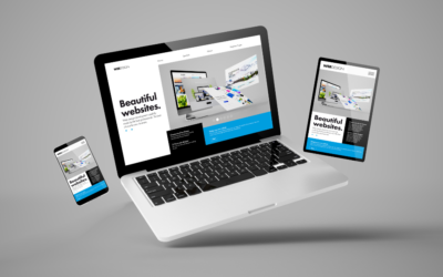
In today’s digital era, having a responsive web design is not just an option but a necessity. With the increasing use of mobile devices to access the internet, businesses must ensure their websites are mobile-friendly to provide a seamless user experience across all devices. Responsive web design ensures your site adapts to different screen sizes, offering an optimal viewing experience. This comprehensive guide will delve into the significance of responsive web design, its benefits, and how you can implement it effectively to enhance your website’s performance and user satisfaction.
What is Responsive Web Design?
Responsive web design is an approach to web development that ensures a website’s layout adjusts smoothly across various screen sizes and devices. This design philosophy prioritizes fluidity, flexibility, and scalability, allowing content to render correctly on desktops, tablets, smartphones, and even smaller wearable devices.
- Definition: Responsive web design uses flexible layouts, fluid grids, and media queries to ensure a seamless user experience across different devices.
- History: The concept of responsive design emerged with the proliferation of mobile internet use, driven by the need for websites to be accessible on smaller screens.
- Comparison: Responsive design differs from adaptive design, which uses fixed layouts for different devices, and mobile-first design, which prioritizes mobile user experience from the outset.
The Key Benefits of Responsive Web Design
SEO-Friendly Content:
Responsive web design offers numerous advantages that can significantly enhance the performance and user experience of your website. Here are the key benefits:
Enhanced User Experience
A responsive design ensures users have a positive experience regardless of the device they use. This leads to longer site visits, lower bounce rates, and higher engagement. Users can navigate easily, read content without zooming, and enjoy a visually appealing layout tailored to their screen size. Click to read Top 10 Features of Business Websites in 2024
Increased Mobile Traffic
With over half of global web traffic coming from mobile devices, a responsive design ensures you capture and retain mobile users, expanding your reach and potential customer base. Mobile-friendly websites are more likely to attract and retain visitors, translating into higher conversion rates and sales.
Faster Loading Times
Responsive websites typically load faster on all devices, but especially on mobile devices. This speed improvement is crucial as faster load times are associated with better user retention and higher search engine rankings. By optimizing images and using a responsive framework, you can significantly reduce loading times.
Better SEO Performance
Search engines, particularly Google, prioritize mobile-friendly websites. Responsive design helps improve your site’s SEO, making it easier for users to find you through search engines. Google’s mobile-first indexing means that the mobile version of your site is considered the primary version, so a responsive design is essential for SEO success.
Cost-Effective and Efficient
Maintaining a single responsive site is more cost-effective and easier to manage than having separate sites for desktop and mobile. This approach reduces development and maintenance costs, ensuring consistency in branding and user experience across all devices. It also streamlines content management, as updates need to be made only once.
Essential Elements of Responsive Web Design
SEO-Friendly Content:
To create a responsive website, it’s important to understand the core components that maketo create a responsive web design. Here are the key elements you need to focus on:
Flexible Grids and Layouts Using a flexible grid system is crucial for responsive design. Unlike fixed-width layouts, flexible grids use relative units like percentages instead of absolute units like pixels, allowing the layout to adapt smoothly to different screen sizes. This approach ensures that your content remains well-organized and visually appealing across various devices.
Media Queries
Media queries are CSS techniques that allow you to apply different styles based on the device’s characteristics, such as width, height, and resolution. By using media queries, you can create a responsive design that adapts to the specific requirements of different devices, ensuring an optimal user experience.
Flexible Images and Media
To ensure that images and other media elements scale appropriately within your layout, use CSS to set maximum widths in percentages rather than fixed values. This approach ensures that images do not exceed the width of their containing elements, maintaining the overall design’s integrity across various screen sizes.
How to Implement Responsive Web Design
Implementing responsive web design involves following best practices and avoiding common pitfalls. Here’s a step-by-step guide:
Best Practices
- Mobile-First Approach: Start designing for the smallest screen and work your way up. This ensures that your website is optimized for mobile devices from the outset and scales up effectively for larger screens. For an in depth guide, MDN Web Docs provides comprehensive and current best practices for responsive web design – you can read more here.
- Fluid Grid Layouts: Use a grid system that scales with the screen size. Tools like Bootstrap and CSS Grid can help create fluid and responsive layouts.
- Viewport Meta Tag: Ensure your HTML includes the viewport meta tag to control the layout on mobile browsers. This tag allows you to set the width and scaling of the viewport, ensuring your website displays correctly on all devices.
- Flexible Media: Use CSS to make images and videos scalable, ensuring they fit within their containers on any screen size.
- Consistent Design: Maintain a consistent look and feel across all devices. This includes using consistent fonts, colors, and visual elements to create a cohesive user experience.
Common Mistakes to Avoid
- Ignoring Touch: Ensure buttons and links are touch-friendly, with adequate spacing to prevent accidental clicks. This is especially important for mobile devices with smaller screens.
- Overloading with Media: Optimize media to prevent slow load times. Compress images and use modern formats like WebP to reduce file sizes without compromising quality.
- Poor Typography Choices: Use readable fonts and sizes for all screen types. Ensure that text is legible on small screens by choosing appropriate font sizes and line heights.
Embrace Responsive Web Design for Optimal Performance
Responsive web design is crucial for delivering a seamless and engaging user experience across all devices. By implementing the principles and practices outlined in this guide, you can ensure your website meets the demands of today’s mobile-first world. At WebAdjusted, we specialize in creating responsive websites that not only look great but also perform exceptionally. Let us handle the technical details, so you can focus on growing your business.


How to Conduct Effective Keyword Research
Recent ArticlesIn the realm of digital marketing, effective keyword research is the cornerstone of a successful SEO strategy. It involves identifying the terms and phrases your target audience uses to search for information related to your business, products, or...

Top SEO Strategies for Small Businesses
Keyword research is the first step in any successful SEO strategy. It involves identifying the terms and phrases that potential customers are using to search for your products or services. Tools like Google Keyword Planner, SEMrush, and Ahrefs can help you...

What is SEO and Why is it Important for Your Business?
SEO, or Search Engine Optimization, is the practice of enhancing your website to improve its visibility on search engines like Google. This increased visibility can lead to more traffic, higher conversion rates, and ultimately, greater success for your business....

Top 10 Features Every Business Website Should Have in 2024
In 2024, having a well-designed and functional website is more important than ever for businesses of all sizes. A website is often the first point of contact between a business and potential customers, making it crucial to leave a lasting impression. This guide...
How to Choose the Right Website Development Service for Your Business
In today's digital age, having a professional and functional website is crucial for any business. Your website is often the first point of contact for potential customers and can significantly impact your brand’s perception and success. Choosing the right website...

“
Ready to transform your website with responsive web design?
Contact us today for a free consultation and learn how our expert team can help you create a mobile-friendly website that drives results. At WebAdjusted, we take the hassle out of the technical details, providing you with a seamless and efficient solution tailored to your needs.

Not sure if this is for you?
Related Articles
How to Choose the Right Website Development Service for Your Business
In today's digital age, having a professional and functional website is crucial for any business. Your website is often the first point of contact for potential customers and can significantly impact your brand’s perception and success. Choosing the right website...